Defining Brand DNA

The Story

Elevating a brand through a consistent language across an entire platform.

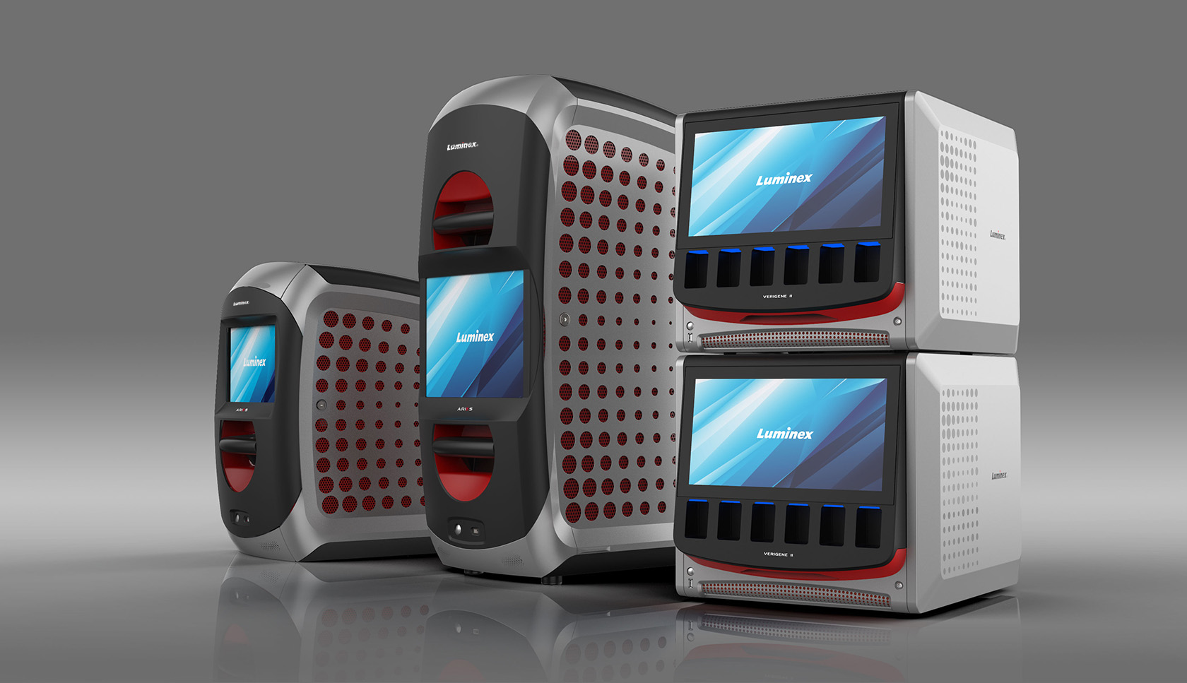
Most molecular diagnostic laboratories use a range of aging equipment and are looking to next generation systems to consolidate their testing into fewer platforms. There is a premium placed on space and efficiency, and each device must earn its place in the laboratory. The M3 team helped Luminex develop a suite of minimal-footprint instruments that simplify the laboratory’s workflow and provide a premium user experience. M3’s challenge was to create and implement a new visual language on a series of products to highlight each system’s advantages and represent Luminex brand values.

01 02

ARIES

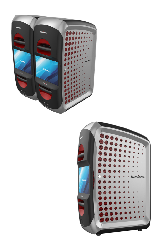
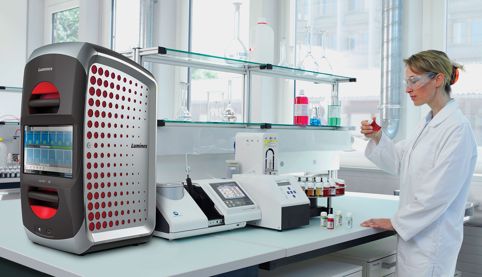
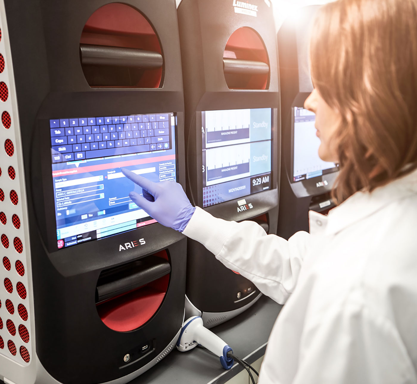
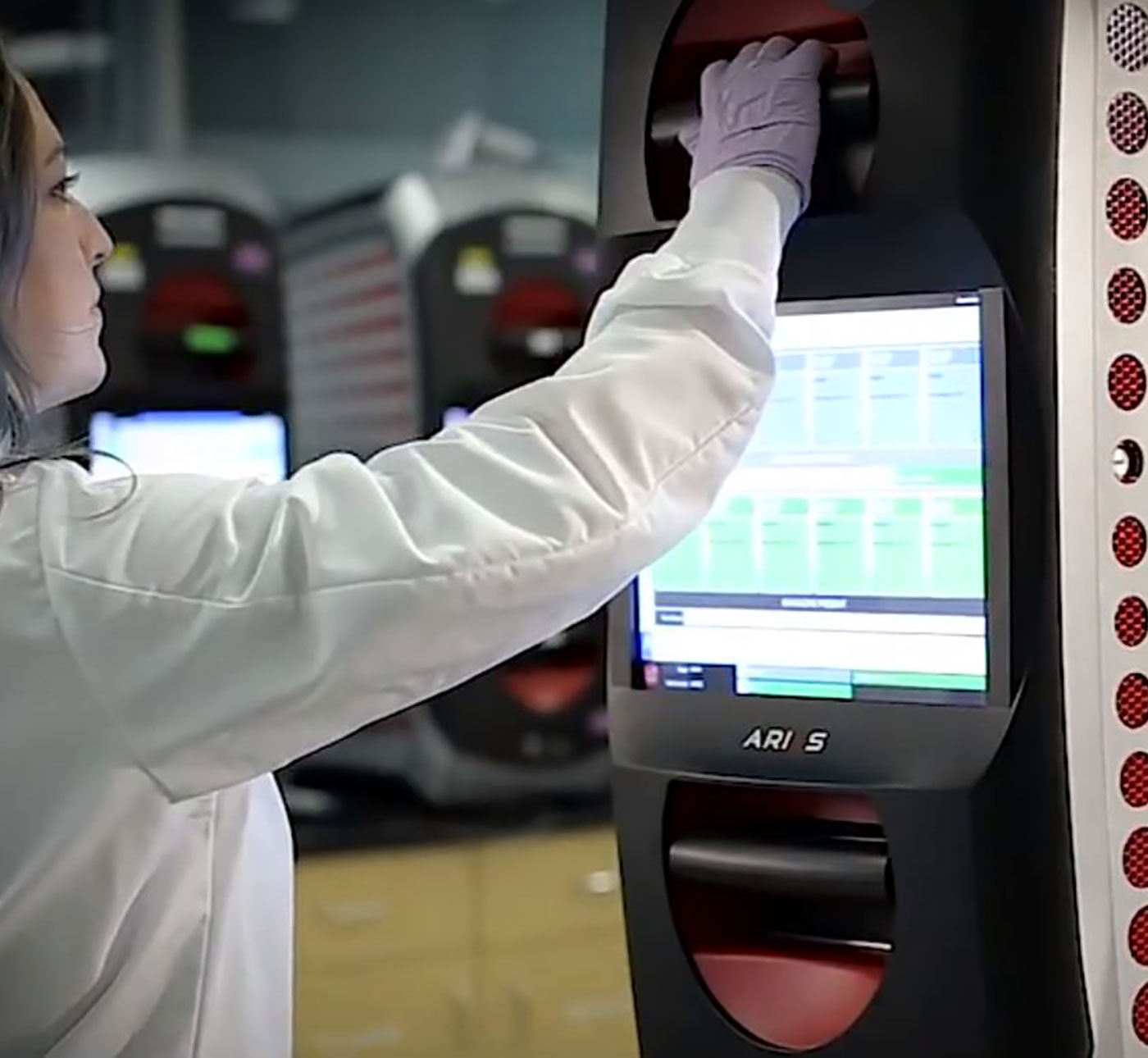
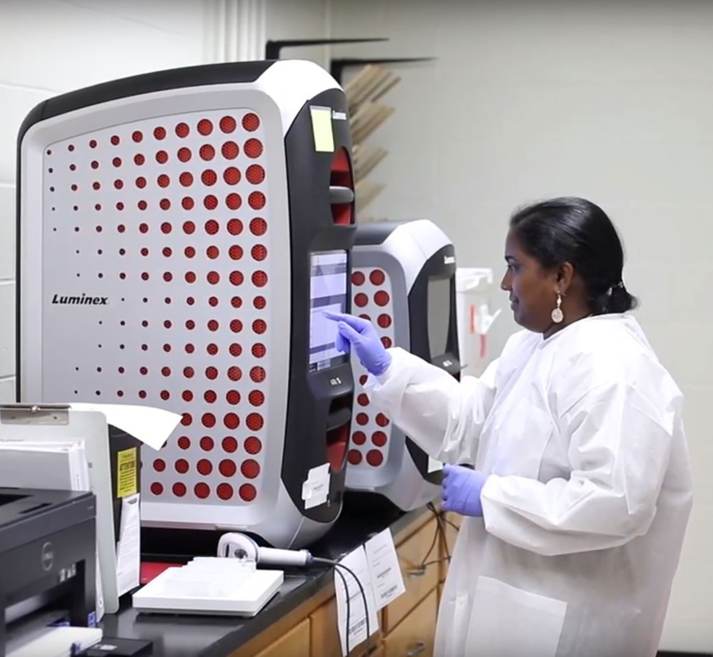
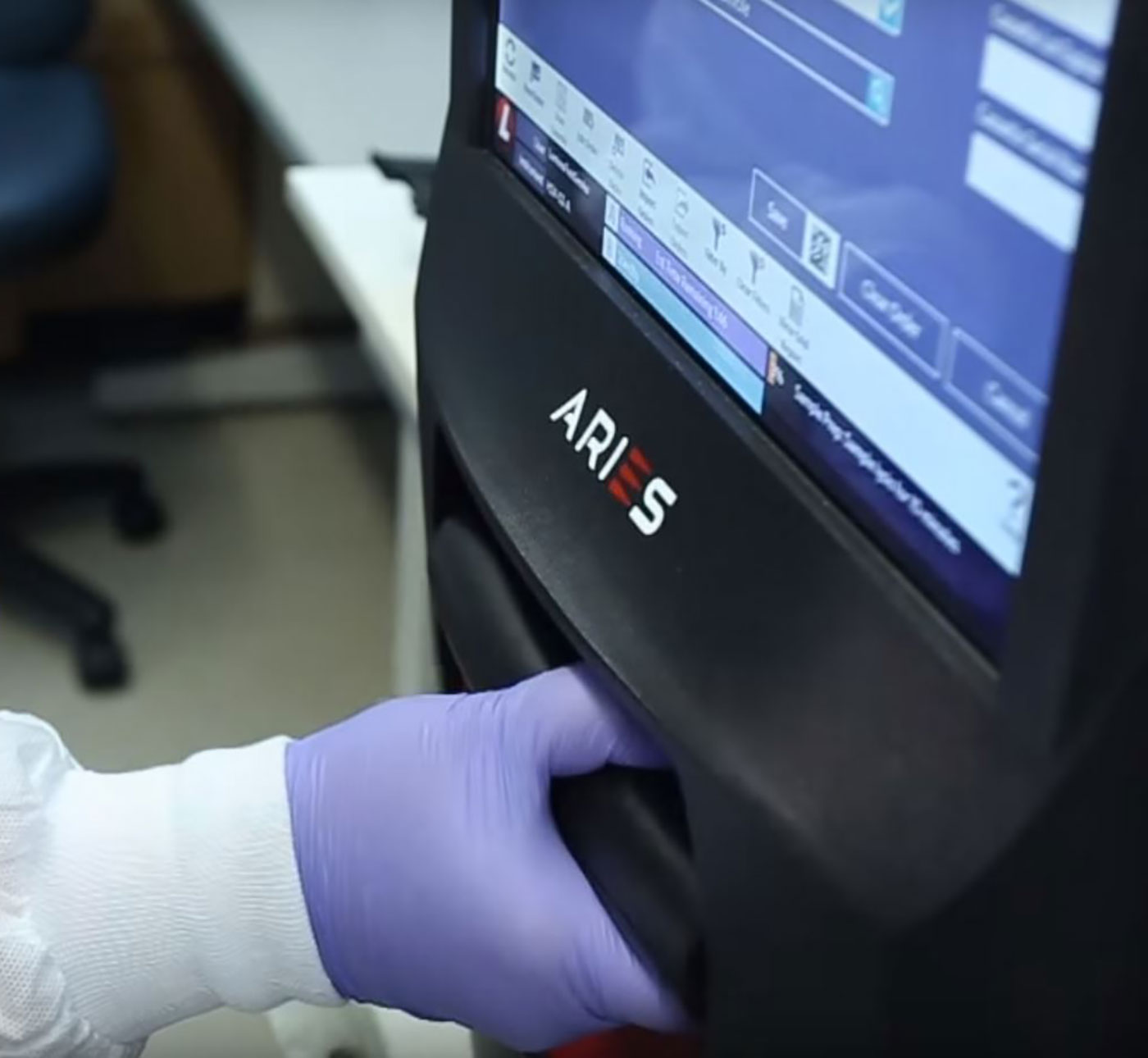
Leveraging the research findings, M3 proposed a radical, vertically oriented architecture to reduce the footprint of the ARIES® System— the first instrument to use the new Design Language. This strategy created a natural landing between the two bays and planted the seed for what would become one of the Luminex’s signature elements: large, integrated touchscreens. While the majority of diagnostic devices require a standalone desktop computer, all of Luminex’s new instruments incorporate this functionality, delivering on the goal of maximizing usable benchtop space and improving workflow.

02 02
The Details

Verigene II

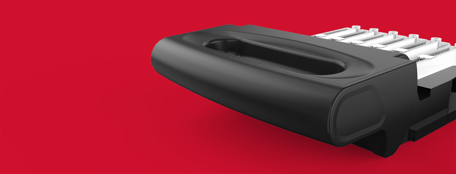
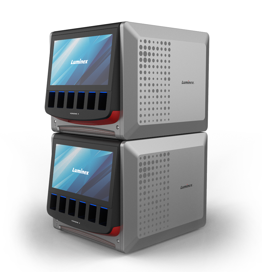
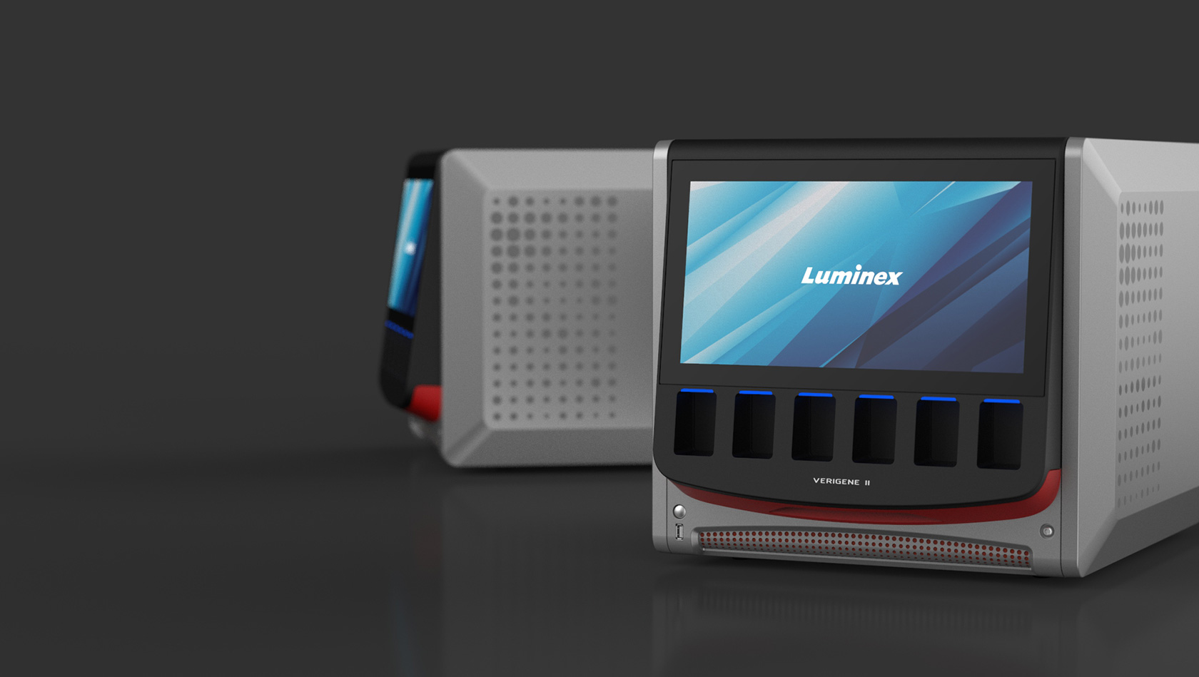
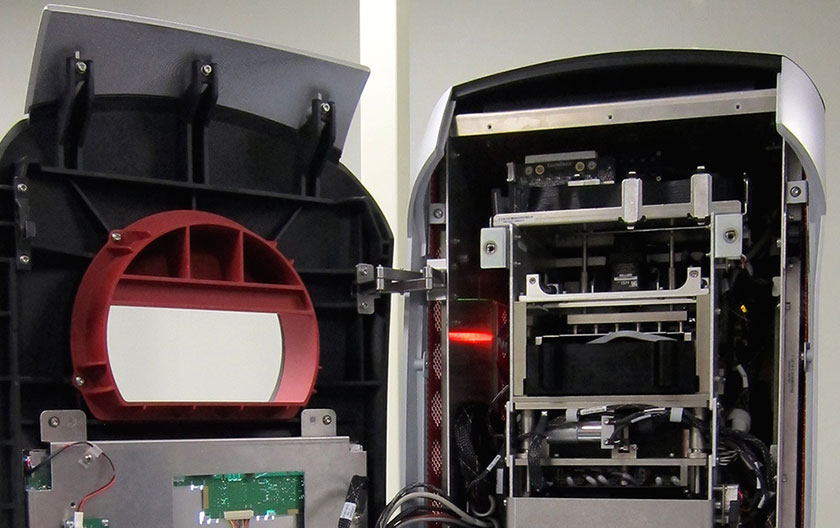
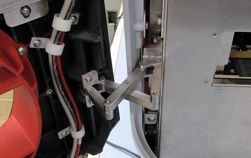
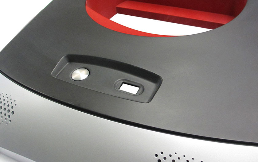
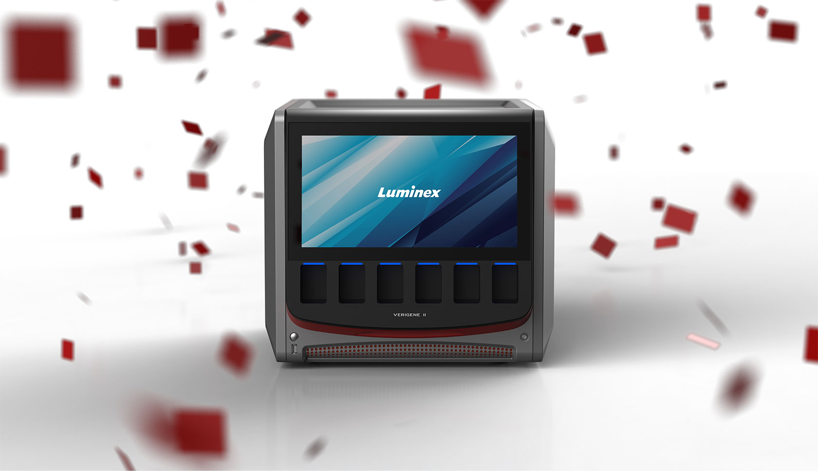
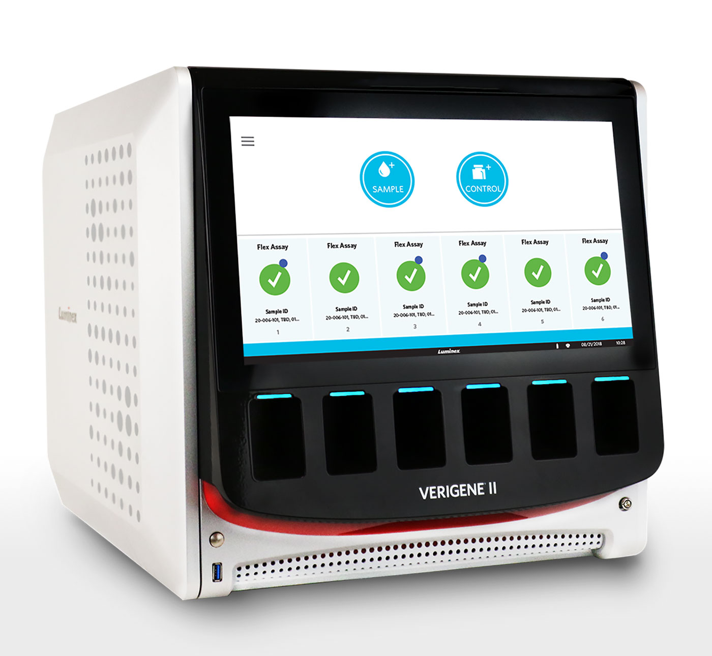
The VERIGENE® II System offered a different set of challenges from the ARIES® System thanks to the desire to stack two systems. To address this, the feet and top panel were designed to nest tightly together to ensure a secure fit and uniform appearance. The recessed top panel serves as a place to safely store prep trays and other accessories when instruments are not stacked. A clever slide-and-rotate hinge allows access to the internal blades without interfering with neighboring devices. The VERIGENE® II System side panels were also designed to be rotated 180 degrees for use on either side to reduce part count.

Addressing stakeholder needs

M3 performed several contextual research visits to fully understand the lab environment’s design constraints and stakeholders. It became immediately apparent that a significant issue in the lab setting is usable workspace. Benches are crowded with instruments, and technicians must interact with multiple devices to perform a single test.

Rational Problem Solving

M3 determined the most efficient component manufacturing process and then worked with vendors to optimize each part for rapid injection molding (RIM).

Quickly Delivering Impactful Solutions

With design and engineering working in concert, M3 delivered a full set of production-ready part designs for the ARIES® System within 3 months, including a custom hinge for the front panel and a striking graphic perforation pattern for thermal management.

Communicating with Color

The dark, central core of each instrument contains all of the primary interactions and is rounded off with the signature chin element. This nucleus is then capped on either side with strong forms that visually protect the technology within. To create a cohesive brand story, the unique dot pattern used in marketing collateral was incorporated as a functional element across instruments.

Contact Us

How can M3 Design accelerate your product development and experience designs?

Let’s Talk