Article
Chasing Design Trends or Building Your Brand? How to Develop Products for the Long Haul
Incorporating flashy design trends doesn’t always make sense. Here are 3 ways you can strike a balance between new ideas and long term product success
Design trend forecasting is, for the most part, a hoax. Especially in verticals like industrial product design — where development and life cycles are long — selling design work based on trends isn’t much better than snake oil.
Sure, we want to create products that are modern, sleek, and inviting. And as design leaders, we should keep our fingers on the pulse of our industry to stay relevant and informed. But our design choices should always be based on what’s best for the client and the end-user, not whatever happens to be trending at the moment.
So why talk about trends at all?
First, there are plenty of eye-catching and disruptive concepts out there that really shouldn’t be thought of as trends. And second, there are ways to take the essence of a trend and use it to elicit the response you want — all while thoughtfully building your brand.
Here are 3 legitimate ways to incorporate the latest trends into your products’ designs.
1. Embrace Sustainable Design as a Habit, Not a Trend
Sustainability is fashionable, and consumers feel a lot of pressure to choose products that are planet-friendly. But unfortunately, there are lots of ways the design industry has worked hard to make products look sustainable when in fact they are anything but.
As designers, we can and should be using our creative thinking to incorporate authentically sustainable design choices into our products. That’s true whether we’re creating consumer-facing products or designing an industrial-grade medical device. And to effect lasting change, we need to view sustainability as an ongoing practice, not a way to cash in on the latest trend.
Here are two ways to do just that.
Modular Design
Many authentically sustainable design techniques aren’t evident on the surface. For example, modular design is a smart and effective way to reduce product waste. With modular design, you don’t have to replace an entire product when one piece wears out or becomes obsolete. By no means is this a new or revolutionary practice. We’ve seen it before, but it’s definitely a product strategy that could be worth considering. You can replace one part, upgrade it, or swap it out for new technology. In a manufacturing setting, this can significantly increase the useful life of machinery, devices, and equipment that would otherwise prematurely end up in a landfill.
Modular design can benefit consumers, too. Think about customizable keyboards. They’ve been popular among gamers, but have now become ubiquitous among remote employees as well. Because users can choose the features that matter to them — preferred layout, keycap type, color, size — they’re more likely to use that keyboard for a longer period of time. And again, this extends the product’s life cycle.
Designs That Age Well
Another way to design with sustainability in mind is to create products that stand the test of time. We all have that favorite pair of jeans that look stylish no matter what particular fashion fad is trending at the moment. We should look for ways to incorporate a modern yet classic look and feel into product design, too.
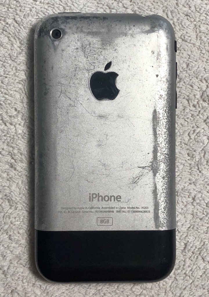
The original iPhone is a good example. The coating featured a distressed finish that looked great out of the box while also showing actual wear-and-tear over time. And while subsequent models have looked slightly different, they have ultimately remained reminiscent of the original’s visual identity.

This is so subjective, but I love sporting a product that has a bit of history behind it. Many of the best designs spark a memorable connection and become part of the stories and memories consumers carry with them.
As you thoughtfully build your brand for the long-term, these are just two of many ways to incorporate sustainability into your brand’s design language.
2. Stay True to Your Brand’s Design Language (But Look for Ways to Push the Envelope)
Examining trends can be a helpful way to modernize your brand’s existing suite of products. And if you want to elicit a response from your customer base and grab attention, it can be tempting to introduce something exciting and new to your product line.
But remember: If you’ve worked hard to build your brand into your design language, you don’t want to undo those efforts simply to chase what’s fashionable. You need to walk a fine line between preserving your brand’s integrity and positioning your products for the future.
In other words, balance is key. The way we find that sweet spot with our clients is to present concepts that range from mild to wild. On the mild end of the spectrum, the concept might include very subtle iterations on elements of the existing design language. Then, as we begin to swing the pendulum to the wild side, we include elements that push the boundaries and extend beyond the client’s current comfort zone.
Typically, we land somewhere in the middle. The goal is to produce a design that feels modern, fresh, and exciting — but not totally foreign or out of place.
The same exercise is valuable to use with companies establishing a cohesive design language for the first time. Whether you’re growing your brand or creating it from scratch, it’s crucial to incorporate only the trends that contribute to that larger strategic picture.
3. Evaluate Design Trends Based on Your Industry
At the end of the day, you should make decisions about your products’ designs based on how your product roadmap intersects with the needs of your particular industry. There’s simply no one-size-fits-all approach.
If you’re a lifestyle product designer, it makes sense to look for ways to incorporate current trends to stay at the forefront of your consumer-based industry. For example, you might look at Pantone’s color of the year to make sure the hues you select are popular with buyers and increase sales. But if your products live in an industrial environment for 5 to 10 years or longer, you need to be focused on longevity and staying power.
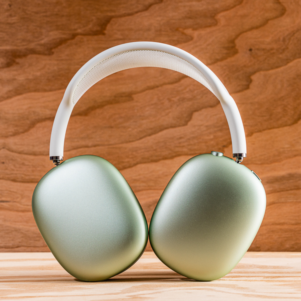
Keep in mind: some design trends look good in theory but simply don’t work for a particular industry or product type. For example, right now it’s popular to create layered designs using fabric and other textured materials. That’s fine for a consumer product like Apple’s wireless headphones. By no means is Apple a trend setter in this regard, but they do often create a larger wake of design inspiration in their path.

But does it make sense to layer fabric and textures onto just any product, simply to hop onto a popular bandwagon? Of course not. Just because something looks cool doesn’t mean it’s the right design choice for every industry.
Another salient example is maximalism. It’s all the rage in interior design and fashion right now. And it might appeal to some consumers as a result. But should you incorporate this trend into your product’s user interface? Or will it confuse your end-user needlessly?
There might be very good reasons to make design decisions based on a maximalist perspective or borrow inspiration from other popular frameworks. Just make sure they’re the right choices for your product.
Make Your Product Roadmap Your #1 Priority
Looking at trends can provide inspiration and spark new ideas. And as a design leader, it’s important to continually produce new concepts to help drive your brand forward. But chasing trends for the sake of it is rarely a good idea. Without a healthy dose of discernment and restraint, trend-focused design can lead to diminished ROI.
It’s always a smart move to prioritize sustainability — which is popular but shouldn’t actually be considered a trend at all. And there are times you should push the envelope to help your brand stay relevant in the market. Just make sure you stay true to your design language. And above all, create products that meet your particular client and user needs. That’s the best way to build your brand for the long haul.


