Article
How to Speed up Development with Crude Prototypes (aka Mock-ups)
Speed up your product development by using quick and dirty mockups. Waiting for the real thing just slows you down and leads to poor outcomes. Mockups rule!
All too often, companies wait to vet a new concept or product idea with end users until they have a production-looking prototype. If you’re doing this, Why?
Maybe it is because you are trying to impress your boss.
Or maybe you’ve trained your customers to only evaluate production-looking prototypes.
Whatever the reason, stop.
You’re risking valuable time and money. Plus, you’re hindering your ability to get brutally honest feedback on your concept or product idea when you need it most.
Meet the product concept mock-up
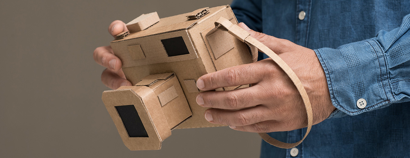
I’d like to introduce the idea of a mock-up. It’s likely the cheapest prototype you’ve ever made, but it may be the most valuable one on a project.
Mock-ups should be used early in projects, ideally during user-needs research activities. This allows teams to test concept ideas with end-users quickly.
Mock-ups help internal teams during concept-development activities to test ideas quickly. They help speed up your development efforts in creative ways. They allow teams to evaluate multiple solutions quickly so they can determine which path to focus on.
The mock-up is also the prototype that will likely generate the most honest and unbiased feedback from your users. As opposed to a mock-up, when you show users a polished, beautiful prototype, what users see is all the time, money, and energy spent in designing and making it. The perceived investment in the prototype makes them less likely to provide a candid assessment, even if the concept doesn’t address a need or problem they have. With a mock-up, they will be more willing to criticize the idea.
Furthermore, when your development team has spent countless hours making that polished, beautiful prototype, those team members get emotionally attached. Some will mainly hear the positive feedback from users, ignore the bad. Others may go as far as to defend the idea versus listening to their customer.
No one likes calling their baby ugly.
With a mock-up, it’s easier to remove bias and emotions. This is obviously a throwaway prototype.
However, I’ve also witnessed how mock-ups can backfire on development teams when they present them to other individuals without proper context. Or, when a high-fidelity prototype was needed to extract the information required at the time.
So let’s dig into the idea of a mock-up further:
- What is a mock-up and how is this different than a prototype?
- When should you use mock-ups during development?
- How to best present them to your customers to gather the feedback you need?
What’s the difference between a mock-up and a prototype?
Actually, nothing. A mock-up is a crude prototype.
However, the word prototype can signify anything from a non-functional aesthetic model to a fully functional pre-production unit. Hence, the term mock-up avoids confusion when it is used to describe the prototype fidelity.
A mock-up can be constructed from anything, as long as it represents an idea or concept as simply as possible. It may represent the overall product idea or a single mechanism within a complex system.
As a general rule of thumb, a mock-up will probably take you a matter of hours to design and a less than a day or two to build. It should represent the bare minimum needed to visualize an idea.
A mock-up can be used to evaluate a product’s size, layout, and/or relative function. Or it can be used to get your customer thinking outside their comfort zone, to inform your next product idea.
In short, the mock-up is a throwaway, but it’s highly valuable in what it will uncover.
Curious what kind of mock-up is right for your project? Checkout our Mock-Up Build Guide for advice on designing and building your next concept mock-up.
Examples of mock-ups
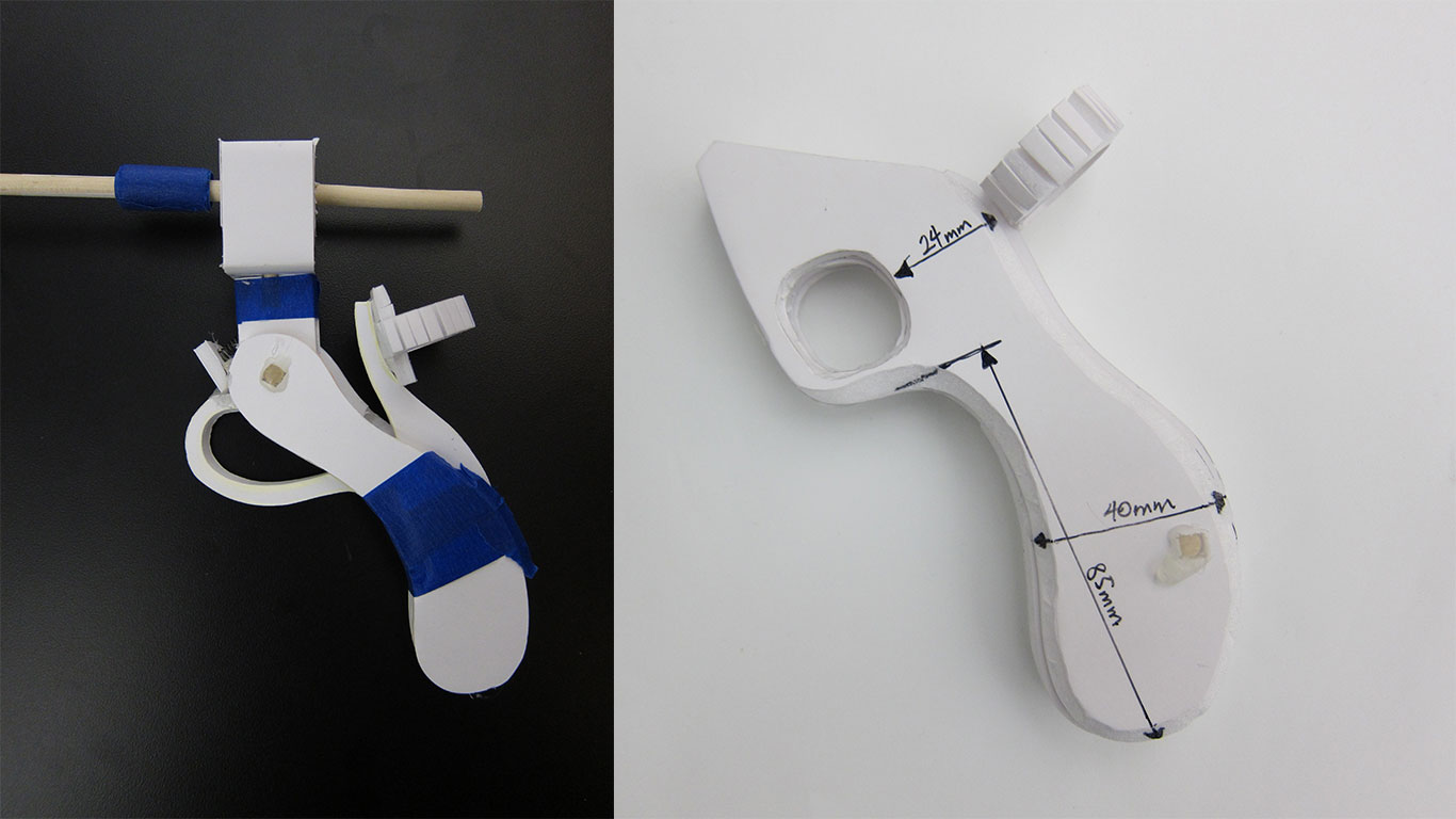
To give you a sense of the form a crude a mock-up may take, let’s go into some project examples teams have used. Below is an early concept mock-up of a surgical instrument handle that was used to test ergonomics and human factors. It was constructed with foam core, tape, and dowel pins.

Right: Laparoscopic instrument handle mock-up to test human factors data.
Similar construction materials can be used to represent physical buttons, connectors, and different screen sizes on a medical console. If you want to get creative, you can use a sheet-metal layer to hold magnets glued onto printed-on graphics. These simple mock-ups can allow your team to quickly build and evaluate different options internally or with end users.
Mock-up don’t only have to be physical. For example, you can integrate physical interfaces with on-screen images to simulate a complex mechanism. We created a digital version of a complex end-effector that had sliding and rotational movement on the screen of a tablet. The mock-up allowed us to test different user-interface control joysticks that were plugged into the table and to test different control methods with end users. This mock-up helped evaluate the required accuracy control vs. hand fatigue to inform the design of the product. This mock-up was faster and cheaper to build than the multiple fully functional prototypes otherwise required.
You can also use VR and AR headsets to design and simulate layouts of a large space such as an operating room, or to test different slot machine cabinet configurations on a casino floor.
Mock-ups can come in many forms, but they represent an idea or concept as simply and quickly as possible.

Right: Hand-held unit mock-ups. Cut and sanded foam with drawn-on lines and glued on print outs
So when do you use a mock-up during new product development?
The best time to use a mock-up is early in a project.
Research Phase
During the research phase, mock-ups are useful to gather user input on the desirability of a product idea. In these instances, you may be discussing a new product idea that requires your customer to suspend reality and envision something completely new and different.
The problem? Many individuals are visual learners. They will need a visual frame of reference to understand the product idea.
Product developers often realize this too late. As a result, they spend their time backtracking and trying to sketch out ideas on paper, which often complicates the discussion further. With a mock-up to view, users can quickly understand and immerse themselves into the future, then provide useful input.
In other words, a mock-up makes it easy to suspend reality and improves the information gathered from users.
Concept Development Phase
Mock-ups are also useful during concept development phases. Use them to weed out which of the five-plus possible directions makes the most sense to develop into functional prototypes for further evaluation.
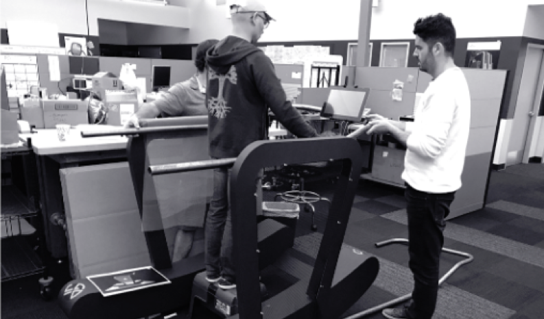
Using office chairs and foam core panels, we once created full-scale mock-ups of interior airline seat layouts.
This allowed the team to evaluate and reconfigure different seating arrangements in real time. It also allowed the team to evaluate storage compartment accessibility and flight-attendant access to divider wall lock-outs for take-off and landing. This learning was then applied to the design before a single sketch or CAD model was created.

We then took this further and mocked-up the various sliding elements by repurposing window roller-shades, scissor lift mechanisms, and drawer slides. These mock-ups enabled the team to evaluate the pros and cons of various sliding mechanical architectures.
So now you have a mock-up. How do you share it with your customer or internal higher-ups without it blowing up in your face?
How to best present mock-ups to users
First off, resist the urge to hand over a mock-up to users without first explaining what they are about to see. This goes for any prototype.
If you skip this step, you’ll likely spend ten to fifteen minutes of valuable time explaining what the prototype can or can’t do and how the final product won’t be made from paper materials. If you don’t set the stage properly, users will struggle to see past the crudeness of the mock-up or shortcoming of your prototype.
To make sure they know it’s not the final product, take three to five minutes to explain:
- That you’ve created a crude mock-up
- What it’s intended to show
The purpose can be to evaluate the size and weight of a product, or to test usability / access, or to study placement of UI buttons and screens.

Make it clear you’re looking for early and honest feedback and that there are no right or wrong answers.
In some cases, you may want to include a visual in the form of a sketch, rendering, or outlined workflow steps, to help guide users. That way, they have an idea of what the product may potentially look or work like before you unveil the mock-up. This visual gives customers a frame of reference and helps them see past the crudeness of the mock-up.
Once users have a chance to evaluate the mock-up and give feedback, encourage them to modify it or interact with it. This helps them to best describe other ways to address their unmet needs and uncover new product opportunities.

To summarize, mock-ups are a valuable tool but are not a replacement for the costly and elaborate prototypes you will create developing your next-generation product. Rather, they are a means to gather proper design and user feedback early in the project.
Mock-ups provide a quick visual and physical representation of an idea that helps many users provide valuable feedback. They allow your team to become faster and more efficient in defining and solving for user needs.
Furthermore, by forcing your designers and engineers to mock-up solutions, you will get them to step away from their computers and into the creative, building mindsets that drove them to be designers or engineers in the first place.
Mock-ups should be shared internally within your development team. Over time, you will find your team using creative ways to mock-up solutions or concepts quickly and efficiently.
So next time you are asked to develop a fully functional prototype to vet an early product idea, make sure someone tested the idea with a mock-up in the first place.


